Project management has a lot of visual tools to help stakeholders know the status of their project, and also understand if there are factors that could potentially derail the project or overshoot the planned budget.
The most popular visual tools in popular management include Gantt Charts, Kanban boards, and roadmaps. S-Curve is a relatively less-popular, but equally valuable visual tool that can help project management stakeholders gain valuable insights about their projects.
What is an S-Curve
An S-Curve is a visual tool that tracks the consumption of resources like budget or man-hours over time. Unlike other tools like Kanban or Gantt charts that focus on project status, S-Curve tracks resource consumption.
This allows you to identify scope creeps or budget creeps before they are likely to happen, and ensure that the project is progressing per plan.
Here is a picture representation of what an S-Curve looks like:
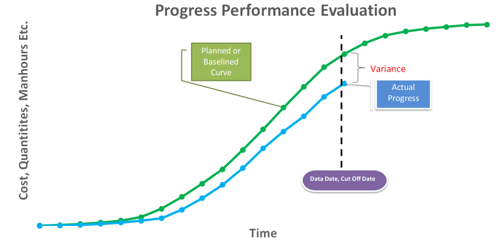
Source: Project.pm
As you can see, an S-Curve is a biaxial chart where the horizontal axis (x) is usually the time, and the vertical axis (y) measures various parameters like cost, manhours, etc.
In the graph above, you can see two S-Curves – one in green, and the other in blue.
The green S-Curve is called the baseline S-Curve. This represents the planned progression of a project, and is generally charted out prior to the start of a project.
The blue S-curve tracks the actual progress. To know the status of a project as compared to the original plan, you pick a point on the X axis, and track it along the vertical line.
For example, if at the end of 1 month, you see that the green line is above the blue line, you know that your project is behind schedule. Alternately, if the actual progress tracks above the planned progress, then you know that the project is ahead of schedule.
Similarly, you can track other parameters like manhours, risk, etc. that we will see in the next section.
Types of S-Curve
An S-Curve can be used to track the progress of the costs, human resources, and several other things. Generally speaking, there are five types of S-Curves, namely:
- Cost S-Curve:
This is the most common and popular form of S-Curve and tracks the progress of expenses over time. This is a biaxial chart that tracks time on the horizontal axis (x), and the cost on the vertical axis (y).
- Progress S-Curve:
As the name suggests, the Progress S-Curve tracks the status of the project. Like all other S-curves, this one too has time on the X-axis, and project status on the vertical Y-axis. You have one baseline graph that charts the planned progress, and a second curve that represents that actual movement. This helps stakeholders understand whether their project is behind or ahead of schedule.
- Resource S-Curve:
The resource S-curve charts the manhours spent (actual) versus the manhours budgeted for (baseline) on the vertical Y axis against time on the horizontal X-axis. The resource S-Curve is generally used in combination with Progress S-curve and the Cost S-Curve for decision making.
If the actual man-hours spent translates to higher costs, but no equivalent progress, then that indicates unnecessary delays creeping into the project. However, if higher man-hours translates to higher progress, but lower cost, then it is possible that the business has offshored the project to a cheaper location, and that has not affected the progress.
You can use these graphs to make a similar argument against offshoring if progress slows down along with lowering costs.
- Quality S-Curve
The Quality S-Curve is a relatively less-prominent graph that is only used by larger organizations with established quality standards like ISO. This curve measures the adherence to quality standards at each step throughout the project.
Unlike the other S-curves mentioned before, this does not demonstrate project progress, but instead only gives a visual understanding of whether quality standards continue to be met.
- Risk S-Curve
Similar to the Quality S-Curve, the risk S-Curve also tracks the risk analysis of the project through time. Risk analysis refers to both the qualitative and quantitative assessments of the project at every step of the way.
The risk S-curve is used by project managers to understand if baseline risk assessments are breached and how to keep the project within acceptable risks at each step. This graph does not give you an understanding of the progress achieved in the project.
Examples of S-Curve In Project Management
Now that we have explained the various types of S-Curves, here are some examples of how S-Curves are used in the real-world.
Example 1: Resource S-Curve with Manhour Histogram
In this example, the cumulative man-hours spent on a project is mapped against the budgeted man hours for every time period. What’s missing in this graph however is the baseline resource S-Curve that you can compare with in order to get an instant idea of whether the project is facing resource creep.

Source: Project Control Academy
Example 2: Progress S-Curve with Linear Mapping
In this example, the actual S-Curve is mapped against a baseline S-curve that is linear in nature. Linear baseline S-Curves are common in manufacturing projects with constant resource usage. An assembly line manufacturing cars, for instance.
In such cases, the project is expected to produce the same quantity of output every day (or any other block of time). As such, the baseline is expected to be a straight line. However, the actual S-Curve could deviate from the straight line due to factors like machine breakdown, or inclusion of extra shifts.
Source: PMI.org
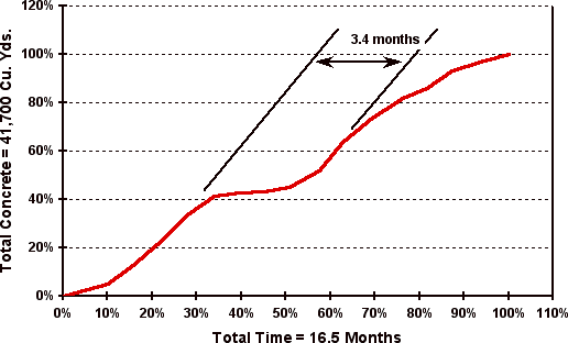
Example 3: Resource S-Curve for resource usage
It is a common misconception that resource S-Curve refers to man-hours alone. Resource S-Curves can also be used to track other kinds of resources. In this example below, you have the graph charting the usage of concrete in the construction of the project.
This chart does not have a baseline S-Curve. Instead, it maps the variance in the actual to track the project delay.
These examples give you a good idea of how S-Curves can be useful in visually depicting the progress of a project. It is also worth pointing out from these examples that there is no one right way to depict S-Curves.
At the end of the day, the objective is to use these charts to track the project status. As long as you can help visually depict this on a graph, you could use a combination of different charting techniques which make the best sense for the particular context.